creative juices

 Over the past couple of weeks, we've been working on a (self) promotional campaign at work.
My boss came up with the theme of "creative juices"—the idea is that we provide our clients with the creative juices that their brand needs.
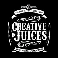
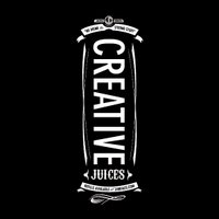
I've put together a couple of initial designs for the Creative Juices seal that we're planning on putting water bottles, t-shirts, magazine ads, etc.
I'm currently leaning toward the circular design over the taller one.
I don't know...
Does it look too much like a Jack Daniels label?


3 Comments:
I like the top one. There's my two cents.
The tall one reminds me of a bottle of toothpaste. I see the Jack Daniels connection on the other one, which reminds me of TGI Fridays. I will now go throw up.
jack daniels, yes. and yet for some i'm sure a bottle of jack is truly their source of creative juices... so perhaps it works! regardless, you are so talented, dave! i'm way impressed.
Post a Comment
Subscribe to Post Comments [Atom]
<< Home